


CRM Dashboard & User Interface Design Case Study
How we designed a functional set of dashboards with an infographic style at its core.
Time Frame: 6 weeks
Tools: Illustrator, Photoshop
Final Product: Built by the client’s developers as their CRM
The Project
Our client engaged Datalabs to design a best-in-class dashboard and user interface for their frontline staff’s main workstation. They were in the process of upgrading from an old platform to a new interface for their front-end staff. It would be part customer relationship management (CRM) software, part dashboard, part reporting interface, and task management tool.
We loved the challenge of doing more than what was traditionally available in an out-of-the-box CRM or BI Software. As interface designers, the notion of combining traditionally isolated parts to make a streamlined, actionable interface – that was both beautiful and useful – was an awesome challenge.
The Design
We wanted to utilize the space available knowing that the user was going to be busy; inundated with daily tasks, inputting new information, and managing their day, week, and month from a single screen.
We needed to create a clear flow of information, actions, and tasks that were available. And we needed to make sure it didn’t overwhelm the user.
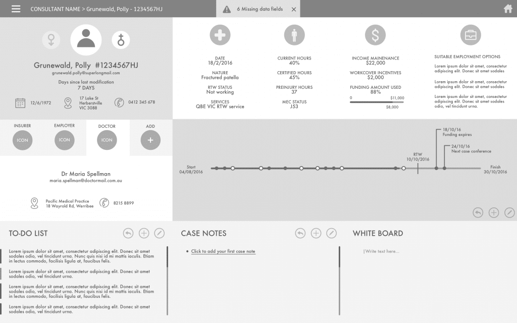
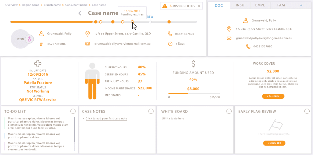
The interface design had a task-oriented view for the user to get an overview of their outstanding items, and, a metrics view so the user could see and keep track of their performance. They needed a management-level view to understand the team’s performance from a line manager’s perspective. A level above this, the client also required a regional manager view – a view above the line manager.
Our Approach
We began with a whiteboard session (a cross between a kick-off, discovery session, and workshop) to get an understanding of the needs, intended outcomes, data, and complexity, and to prioritize the order of the dashboards. After a few hours of asking questions and talking data, operations, day-to-day management, and metrics, we were able to exit the session with two distinct styles for our prototype designs.
We then moved to a wireframing and prototyping phase with each iteration getting a little more detailed until there was enough clarity for a full design with all elements and assent.
The Final Product
We designed two interfaces for the end-user. The first was a top view with an overview of statistics, tasks, areas needing action, and data that needed updating. Second, was a detailed view of all pending tasks that acted as a drill-down from the first interface.
Both views matched data segments to keep the flow and information architecture complimentary. This meant the user would always be looking at the same data layout regardless of the view.
We applied this rationale to the management views, meaning that all the interfaces shared the same information architecture which allows every user level to understand the information as they changed views from the base level up to the aggregated level. This creates a good sense of user intuition when using the interface. Also, it was easier to develop the interface and database. But mainly because of the user.
Outcome
In the end, there were four distinct interfaces designed. Two task-oriented ones and two management.
The purpose of this tool, from the outset, was to develop a clean, data-driven interface that had the ability to show where you were at, what you needed to do when you needed to do it by, and what actions you could take to change anything that needed to be changed along the way.
The management view had the same inherent actions available: to quickly identify the top and bottom, and take action based on what you saw. For example, if a front-end user had an outstanding task, that item would be identified as critical and would be seen first; as a manager, you could see who had a high workload (and who had a light workload) and reassign accordingly.
Like what you see?
Check out our interactive data visualizations page for more details on what we do.