What Makes for Great Data Visualization and Why?
Data visualization can be a powerful way to communicate. When done right, it delivers information with both the weight of respected research, and the cut-through clarity of good design.
Unfortunately, as anyone who has sat through a pie-chart-heavy PowerPoint presentation knows, many attempts to visualize data end with an incomprehensible or meaningless representation of what was once important or interesting data.
So, what makes for good data visualization?
Nathan Yao of flowingdata.com says good visualization is,
A representation of data that helps you see what you would otherwise have been blind to if you looked only at the naked source.
Yao gets to the heart of it – we visualize data because it invites us to look differently at data, and helps us understand it. Good data visualization should both engage the audience and improve both the accuracy and the depth of their understanding.
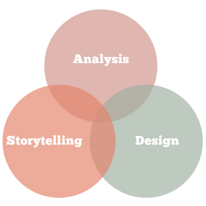
For data visualization to achieve that, it needs three things:
- data analysis
- storytelling
- design
Data Analysis
Explore the numbers – that’s where the story lies.
– Nathan Yau
At first glance, data is just numbers. With analysis, data becomes a place to discover surprising and important stories.
For anyone without a Ph.D. in statistics, that might sound like a big ask, but it’s not as daunting as it sounds. Most data visualizations rely on analysis to find two things: patterns and relationships.
Patterns
It is human nature to see patterns in the world around us – whether it’s a pattern in the weather, the stock market, or in fashion on the street. We do it because patterns help us to predict what might happen next, and the ability to make predictions and prepare for the future is key to our species’ survival.
Good data analysis splices the data in many ways, looking for patterns that emerge over time, across space, or between categories. Exploring the data in this way allows significant patterns to emerge – these patterns tell a story about how the world works or is changing.
A great example of this is the cultural mobility map, created by a team of historians and scientists who tracked the births and deaths of notable individuals like David, King of Israel, and Leonardo da Vinci, from 600 BC to the present day. Using these thought leaders as a proxy for skills and ideas, their data reveals intellectual hotspots and tracks the rise and fall of empires.
If you can clearly visualize a pattern in the data, your audience will instinctively understand the importance of that pattern, it’s something we’ve been doing for hundreds of thousands of years.
Relationships
A ‘relationship’ in data is most often a correlation, in other words, does something go up as another thing goes down?
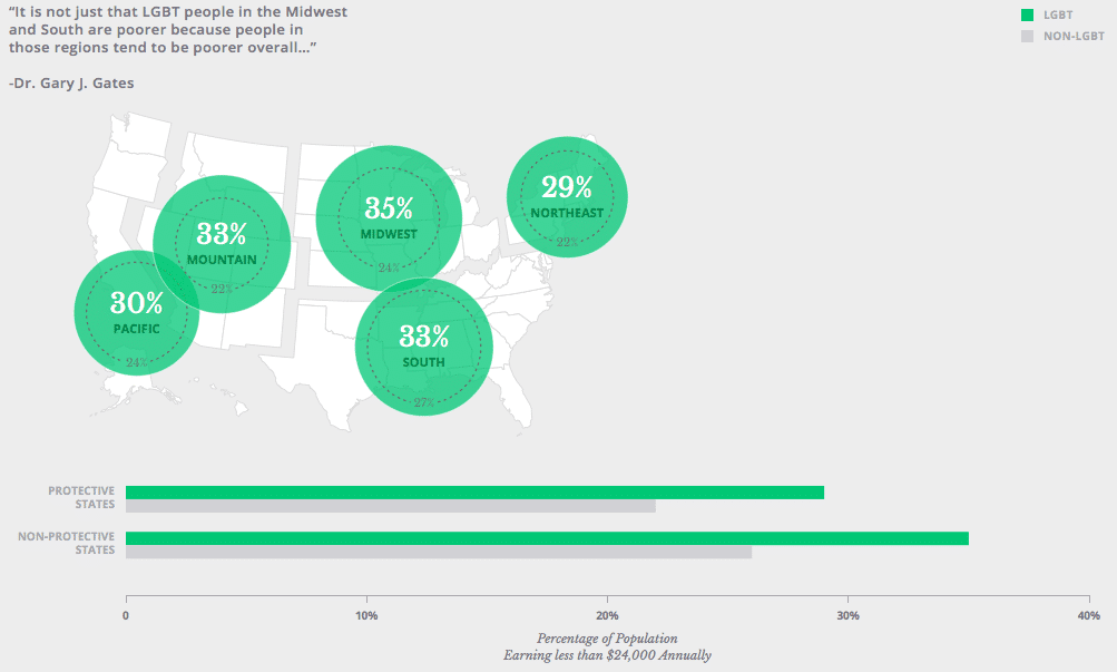
For example, by comparing data from states with and without state sexual orientation non-discrimination laws, researchers at the University of California found a strong correlation between economic security and protection laws.

LGBT people in states without protections are more likely to report household incomes below $24,000 than those living in the states where LGBT workers are protected.
Quality analysis is the first step towards great data visualization — it isn’t until we explore data that we discover what it can tell us. From there, we need to interpret the story for others.
Storytelling with data
Numbers have an important story to tell. They rely on you to give them a clear and convincing voice.
―Stephen Few
Data visualization is used to communicate something to an audience, whether that’s a point of view, a case for change, or simply new information. Few forms of communication are as compelling as narrative, and that is why storytelling is an integral part of data visualization.
Most often, data represents people, places, and objects. Despite this, in its raw form, data remains a meaningless jumble of numbers to most people. Data visualization must make the emotional, social, and cultural connections between data and real life.
To that end, the visualization needs to include information about the who, what, when, where, and how of your data.
To be meaningful to your audience, this information needs to be considered from their point of view. The terms you use, and the concepts you refer to should be familiar to your audience. An audience of executives will require different information to a general audience. Sometimes it is necessary to give the audience further clues (e.g. green arrows to show improvement).
A good data visualization tells a story to the audience, using language and ideas that they understand.
Good data visualization design
By visualizing information, we turn it into a landscape that you can explore with your eyes, a sort of information map. And when you’re lost in information, an information map is kind of useful.
―David McCandless
When you analyze data, you glean your own insights, so there’s no need to explain the significance of the data to yourself. But beyond your audience of one, you must provide a clear and simple explanation of what the data is about, and that’s where good design comes in.
Good data visualization design ensures that everyone who sees it understands what it represents. To that end, good visualizations involve best practice design elements:
Visual Cues
Great books use words to describe characters, scenes and action. Similarly, great design uses visual clues to paint a picture about the data.
Symbols such as the dollar sign, skull and cross-bones and love hearts are all examples of strong visual cues. Abstract shapes and colors can also be used to indicate qualities such as heat, volume and distance.
Visual Hierarchy
Our eyes tend to search for things that stand out. Good design uses this to its advantage to ensure the most important information is read first.
Using larger and smaller sizes is one simple way to establish a visual hierarchy, as is applying bold colors to key data while lightening or softening other elements.
Negative Space
Clutter is the enemy of readability.
Annotation
Annotation can help to contextualize the visualization. It can tell the audience where and when the data is from, who collected it, and how. This kind of context can both help the audience understand the data, and establish its credibility.
No excuses for bad data visualization
Most organizations need to tell data-heavy stories. Many hours and resources go into producing Annual Reports, investor briefings, and a litany of other forms of data presentation. Many more hours are spent digesting them.
Good data visualization can improve the quality of insights gleaned from data and the effectiveness of our attempts to communicate those insights. When so much effort is spent pursuing a data-driven culture, good data visualization becomes invaluable.


