


The Data Visualization Format of the Year (Runner Up): The Interactive Map
With best-practice examples

You may have already seen that this year’s best data visualization format winner was declared: The Interactive Calculator. And even though it was a tough decision, there are some pretty good reasons why. But what came next? Well, I’ll give you a clue: it’s still interactive.
Runner Up: The Interactive Map
The interactive map hardly needs any introduction. This year saw millions of people across the world refreshing their browsers as the US Election results were getting tallied up on a range of online data visualizations – most prominently, the interactive map.
But that’s not the only place for an interactive map. Interactive maps have been used to show corporate data in annual reports, to help people get around every day and less officially, to “showcase” the Rio Olympics. You’ll see what we mean with the last one in the examples to come…
The 2016 US Election
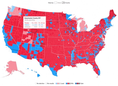 In Bloomberg’s Election Center, we saw a beautifully simple data visualization of America’s voting results.
The map of America, broken down by State, shows clear color differentiation to communicate the electoral winner of the area. On hover, the actual figures are shown. And on click, the map zooms in and reveals the County breakdown of that State. Again, you can hover over each county to see the exact results for each. You can even toggle the map to see the County breakdown across the whole of America.
Keeping text and numeric data clear of the map until needed allowed it to maintain clutter-free. Of course, it also helped that there were only two main contenders with pre-existing color representatives. Given the wide range of demographics in the audience, keeping it simple is pretty important.
On the flip side, for those in the audience who do want to drill down, this is possible too! Throw that in with the fact that Bloomberg’s Election 2016 Center is entirely responsive for mobile and tablet devices and you’ve got a winner.
Corporate Interactive Map Data Visualizations
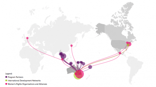
In this day and age, there’s plenty of ways to add some interactivity into what is often incredibly boring: An Annual Report. In this example, The Datalabs Agency was asked to lift the International Women’s Development Agency (IWDA)’s annual report microsite (previously distributed as PDF only) by creating a live map to demonstrate some of IDWA’s data.
To present the full reach, a scroll-initiated animation was created to spread from the IWDA office and reach out to partners, women’s networks, and coalitions across the world. Once the animation ceased, the map would retain the overall reach view and reveal a legend of the different partnerships or organization types. These color-coded categories formed ellipses on the map that contained a short bio, name, and location of the organizations.
The initial animation allowed the map to stand out and entice the audience to engage further with the data.
The Interactive Map Used Every Day: Google Maps
Google Maps continues to be a leader in helping people find places, get live directions and even entertain us when we find weird happenings on Street View (if you’re in the mood for procrastinating, you should definitely look it up). They’re truly a master of the interactive map.

More recently, Google has been adding updates to its Timelapse project through Google Earth. The aim is to show how our planet has changed over the years, making an interactive map the obvious choice for the data visualization format. The bottom toolbar also allows users to quickly zoom in on preset cities to explore. And, just like traditional Google Maps, you can navigate around the area and zoom in and out to explore the world freely. What makes the Timelapse project super cool, though, is the map’s animation taking you through more than 30 years of geographical change. You can even toggle the speed of the animation or hone in on a still from a particular year.
The Rio 2016 Interactive Map
While this one is more for fun, it’s a pretty cool example of how to use an interactive map to engage an audience. The whole map is made from colorful, digital illustrations and includes a few animations to set the scene. The imagery would probably be enough for me to want to keep looking around. But that wasn’t the only encourager.

There’s plenty of gamified elements to keep the user interacting and exploring … Like, ‘Find the rest of the severed body parts’ (referencing the severed foot that was found just meters away from where the Olympic volleyball events were held) and ‘Find the former Guantanamo Bay prisoner who has fled from Uruguay’.
Or, for those more patriotic to the country this map was made in, simply ‘find out where your favorite Great Britain teammates are staying’. A lot of the interactions on the map can also be tweeted. You can reach out to the Great Britain teammates on Twitter, wishing them luck or, more importantly, Tweet when you’ve located all those body parts!
It does, of course, show the venues across Rio used to host Olympic events and include some ‘fun Olympic facts’ based on location, though we’re still questioning their main intention with this. Nonetheless, the eye-catching graphics and intuitive map navigation, tied in with gamification and social integration make this a pretty great example of using an interactive map for user engagement.
Year of the Interactive Map
Interactive maps are a truly visual way to show data and this year definitely took advantage. There are plenty of ways to make use of them too. Look back at these examples to see how you could better engage your audience or bring in some interactivity to your next project. We know we will!
Want to literally map out your data?
Get in touch with us directly by emailing hello@datalabsagency.com
or by clicking the Contact Us link in the navigation.